GRACED FAMILY CHAPEL
DESCRIPTION OF OUR LOGO
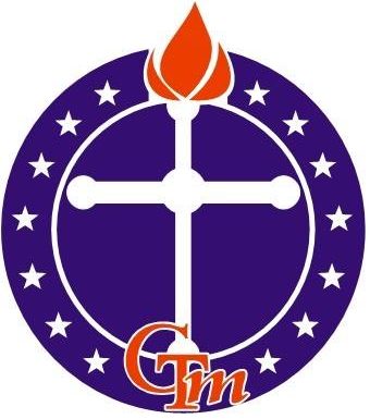
The circular design signifies our Ministry to the global World.
The Seven stars on each side of the circle signify our commitment to raise champions and people of excellence who will shine forth for the Kingdom in a world of darkness.
The three pronged-tongue of fire signify the Trinity: God The Father, God the Son and God the Holy Spirit. The middle tongue is bigger than the other two, signifying the greater influence of the Holy Spirit in our Church age. The tongue of fire is rested on the Cross, indicating that everything about our salvation and sustenance depends on the finished work of Jesus Christ on the Cross.
Logo Colour:
White represents righteousness, purity and holiness
Red represents the blood of our propitiation
Blue represents our royal priesthood
Ministry Slogan
“Always with you”
What makes us Unique?
Four things make Chapel of Grace Transformation Ministry unique.
We are deliberately committed to:
- Helping every member identify their unique divine assignment
- Prepare them to pursue that assignment
- Empower them for the assignment
- Release them to go get started in their assignment
